By Megan Montemarano
With the New Year comes new beginnings—the chance to tackle those resolutions, make a change for the better and refresh. The countdown to 2017 has officially begun, presenting individuals with a blank canvas that’s just waiting to be filled with colorful emotions, meaningful moments and in this year’s case, revitalizing shades of green. “Greenery” is Pantone’s 2017 Color of the Year, offering the opportunity to welcome a fresh and zesty yellow-green hue into your every day…and your home.
Known worldwide as the standard language for color communication to fashion and home styles of all kinds, the PANTONE® Color Institute has been using leading technologies and systems to determine appropriate color selections since 2000. The shade is chosen on a basis of symbolism, reflecting current culture and world trends through a colorful expression, which encapsulates clear mood and attitude. This year’s pick, Greenery, is described in a recent Zillow article as a calming color. It is viewed as a shade of new beginnings, evoking the flourishing foliage and lushness of the great outdoors that is so often associated with nature’s revival during first days of spring. “Greenery bursts forth in 2017 to provide us with the reassurance we yearn for amid a tumultuous social and political environment,” comments Leatrice Eiseman, Executive Director of the Pantone Color Institute. “Satisfying our growing desire to rejuvenate and revitalize, Greenery symbolizes the connection we seek with nature, one another and a larger purpose.”

The modern color also refers to the “go-green” movement, which has reached a crescendo this year, according to Forbes Magazine. This minimalist approach links with the population’s increasing desire to reconnect with what is real in life—a focus on nature rather than always being fixated on technology. “We need a break,” Laurie Pressman, Pantone Color Institute’s vice president, told Forbes. “We need to stop and breathe.” Replenish, reinvigorate, restore—this hopeful color provides an exceptionally fresh outlet for creating an optimistic environment through successful home design in 2017.
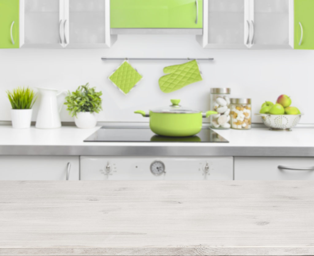
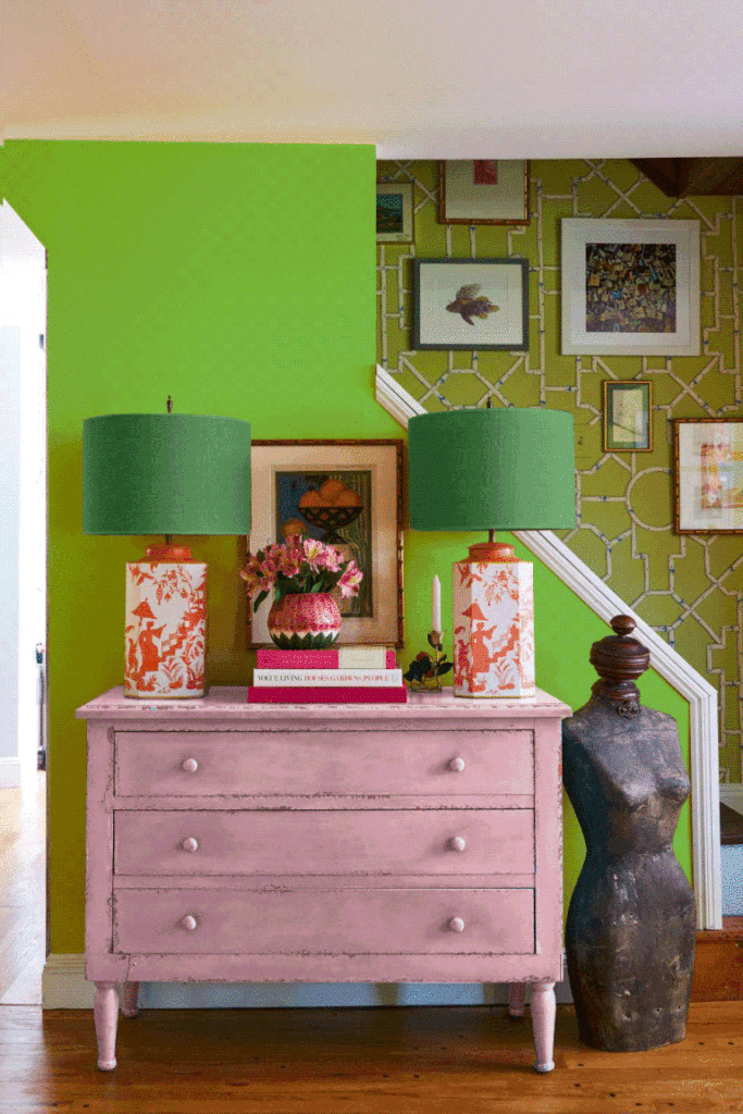
The Perfect Accent Color. Although some may be skeptical of this bright, leafy green hue, incorporating Greenery into your home is the perfect way to add a welcoming zing. Whether re-painting the front door, accent wall or pairing it with wood tones, homeowners using this lively color have the opportunity to add the ideal touch of personality to their residence. Not ready to fully embrace Greenery? Houzz suggests incorporating the shade into your home with subtler tactics such as decorative elements, pillows, curtains, light fixtures and other verdant accessories.
See a list of Pantone’s recommended Greenery color pairings here.
Green Can be Neutral. Believe it or not, Greenery serves as a neutral base among other colors. Elle Décor looks at three very different color schemes all built around the shade, and points out that green can always be used as a neutral backdrop, just like it is outside. The magazine highlights three color palettes against the same green wall—each tone works beautifully, highlighting the unique way Greenery can be used as both an accent color and neutral foundation in home décor.

“In home design, we have seen this brighter yellow green before, but the acceptance level has now reached a point where people are really embracing it,” Eiseman tells Elle Decor. “We feel like next year’s going to be the breakout year for the color, even for people who might look at it and say, ‘Oh, I’m not so sure if I like that.'”
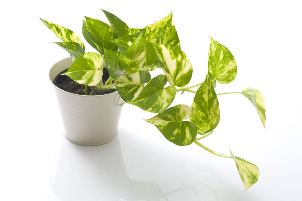
Simply Add Greenery. Of course, perhaps the easiest way to integrate Greenery is by actually adding greenery throughout your home. Pick out a vibrant plant that’s low maintenance, place it in a simple vase and let the room re-oxygenate. DIY Network describes the addition of plants to complement the chosen Color of the Year as having “a dramatic effect that requires little effort.” To top it off, enriching your home with natural décor creates a clear connection to the peace, simplicity and untainted beauty of Mother Nature. After all, isn’t that a main purpose behind Pantone’s 2017 color decision?

Looking for more “Greenery” décor inspiration? Architectural Digest shares helpful tips for decorating and painting with this luxuriant shade of green.
